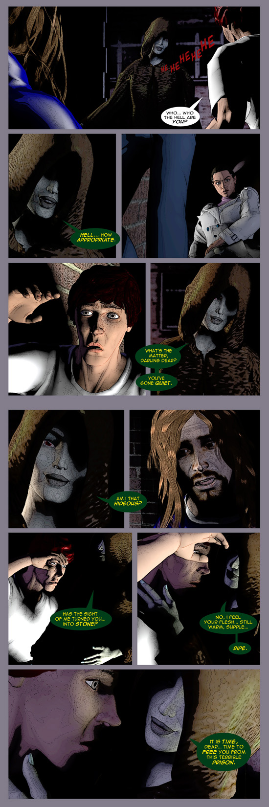
The Secret of Cass Corridor, Pg 15-16
If you have any feedback, I’d love to hear it.
BUT… first a little disclaimer. These opening pages were my first attempt EVER at doing a comic.
You’ll find that the work gets better the further we go along. I think… well, I hope 🙂


wow, so far I am loving this comic. Now, mind you I don’t writ/draw comics but I do read a lot of them…and I am impressed 🙂 Do keep up the good work.
hey I still think the art is unique. In a good way. But slightly stiff. No offence. I couldn’t do any better. I’m no Juan Jose Ryp.
Your characters kinda look like they are (or started out as) 3D renders. Is that the case?
Guilty as charged.
not bad so far … constructive feedback re: art
1/ your 3d program’s shader, or whatever you’ve postprocessed with, is doing terrible things to the gradients, particularly on the faces. like it’s doing isobars along where one colour becomes the next. everyone looks like they’ve been scribbled on with thin, light coloured sharpies. could do with looking into what’s happening with that.
2/ ouch, next time you need to put a guitar in, make it part of the render rather than drawing it on top. it really stood out as a flat 2d add-in. not badly drawn, but just clashed.
other than that, it’s a hell of a lot better than far too many starter comics i’ve seen! and the models don’t seem to be “poser default” either.